

The Seam Is the Statement
A clean finish has long been fashion’s version of good manners – the thing you do so nobody notices the construction. Press the seams flat, hide the raw edges, make the garment look like it materialized whole. For decades, that invisible perfection was the goal. Now, a growing number of designers are doing the opposite: pulling the seam forward, stitching it in a contrasting thread, and daring you to stare directly at the join.
Contrast-stitch seam detailing – where visible stitching in a different color, weight, or texture runs along structural seams – has been working its way through collections steadily enough that it no longer reads as a styling experiment. It reads as a position.
This is not topstitching for function. It is topstitching as the point.
Where the Trend Is Landing
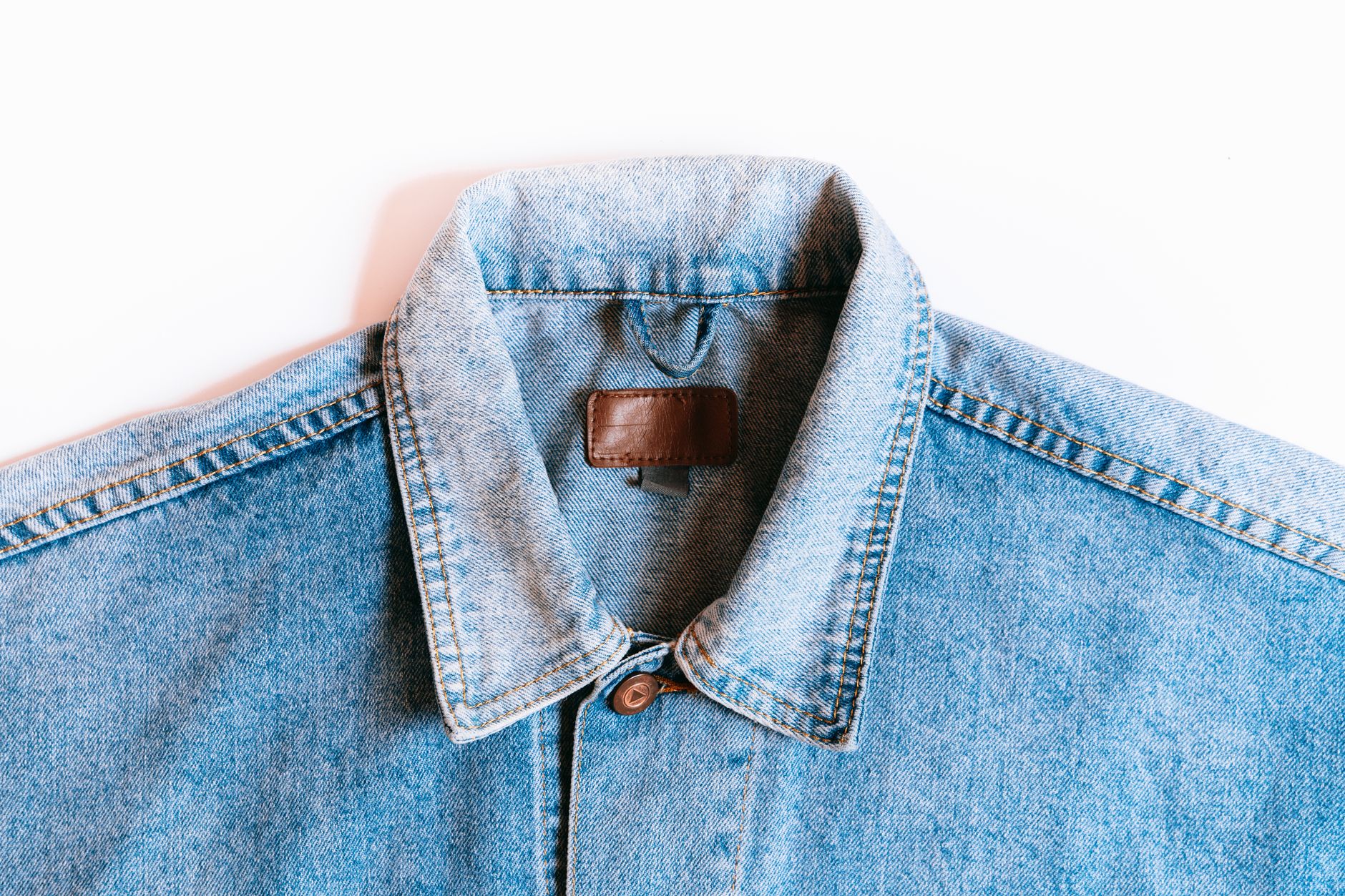
The detail is showing up across categories in ways that suggest it is not confined to one aesthetic. Denim is the most obvious home – contrast orange or gold stitching on indigo has always existed there – but the current wave is lifting the technique out of workwear roots and dropping it into tailoring, knitwear, and even suiting. A charcoal wool blazer with cream stitching running down the lapel seam and across the chest pocket reads as deliberate and considered in a way that the same jacket without it simply does not.
Streetwear has been running with this for a few seasons, threading white or red stitching through black outerwear in ways that map the garment’s architecture like a blueprint. The appeal there is obvious: it signals craft and construction knowledge without requiring the wearer to explain anything. The stitching does the talking. What is newer is seeing the same logic migrate into more formal contexts – dresses with contrast seaming along the bodice, tailored trousers where the side seam is traced in a thread two shades lighter than the fabric. These are not distressed or deconstructed garments. They are impeccably made garments that choose to show you how.
The color combinations carrying the most momentum are tonal-adjacent rather than high-contrast. Off-white on cream, rust on tan, slate on navy. The effect is subtle enough that it rewards attention without screaming for it. When designers do go bolder – red thread on a white linen shirt, for instance – the result leans graphic, almost typographic, treating the seam like a line drawing on the body.
Why the Clean Finish Lost Its Edge
The appetite for visible construction has been building for years through the growing interest in visible garment details that signal making rather than manufacturing. Raw hems, exposed zippers, unlined jackets worn open to show their inner canvas – all of these move in the same direction. They say the garment was made by someone, not extruded by a process. Contrast stitching fits that logic precisely: it requires a deliberate decision at the machine, a choice about color and thread weight that a factory producing volume at speed does not typically make.
There is also something worth understanding about how people are reading clothes right now. Minimalism without texture or detail can start to feel anonymous. A garment that is beautifully cut but entirely smooth reads as confident only if the wearer already projects confidence. The same garment with a seam traced in contrasting thread has something to anchor the eye – a visual entry point that does not depend entirely on fit or styling to create interest. It is self-possessed in a way that pure austerity sometimes is not.
The clean finish is not going anywhere. It remains the standard for a reason – it is versatile, ageless, appropriate in virtually every context. But “appropriate in virtually every context” is not always what fashion wants to be, and right now, more designers and consumers are reaching for the stitch that admits it has structure, and is proud of it.
How to Wear It Without Overthinking It
The easiest entry point is a piece where the contrast stitching is already built in – a structured jacket with visible seaming, a pair of trousers where the side seam is traced in a lighter thread. The detail handles itself. The rest of the outfit can be simple: the stitching gives you enough. Where people go wrong is stacking the detail with too much else – a patterned shirt under a contrast-stitched blazer, accessories competing for the same visual space. This particular detail works best with a clean surrounding.
For those building pieces from scratch or customizing, the thread weight matters as much as the color. A thick, matte thread in a tonal contrast reads as craft-forward. A thin, shiny thread in a bold contrast reads as more graphic and sportswear-adjacent. Neither is wrong, but they belong to different outfits. The thread carries information about intention, and that information lands whether you plan it or not.
What is interesting about where this detail is right now is that it sits at a precise moment before overexposure. The people wearing it are largely the ones paying close attention to construction and textile quality – not the first wave of runway followers, but not the mass-market moment either. Once a contrast-stitched seam starts appearing on every fast-fashion site in five colors, the conversation will shift. For now, the detail still has the quality of something found rather than pushed.
Frequently Asked Questions
What is contrast-stitch seam detailing in fashion?
It is when visible stitching in a different color or thread weight runs along a garment’s structural seams, making the construction a deliberate design feature rather than hiding it.
How do I style a contrast-stitched garment without overdoing it?
Keep the rest of the outfit simple. The stitching creates enough visual interest on its own, so avoid competing patterns or heavy accessories.