



The Print Clash That Refuses to Fade
Tonal dressing had a long run. The idea of wearing head-to-toe camel, or a single shade of dusty sage from collar to ankle, dominated fashion conversations for several seasons – quiet, controlled, and endlessly photographable. But Marni has been doing something different, and the results are starting to outlast the trend it was supposedly running against.
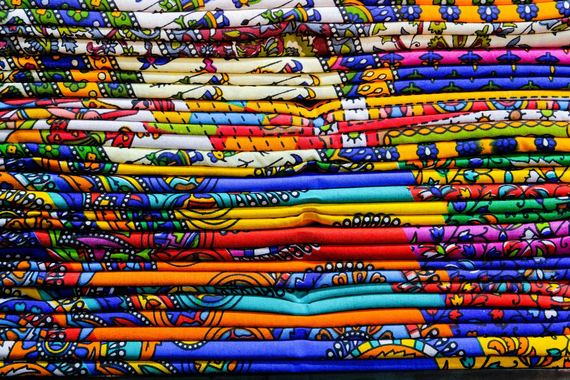
Why Marni’s Approach Works Against the Grain
The house, under creative direction that has always leaned toward the eccentric, built its visual identity on something tonal dressing fundamentally rejects: deliberate dissonance. Stripes layered over florals. Geometric blocks placed next to organic swirls. Colors that have no business sitting next to each other, sitting next to each other anyway. What makes this work is not chaos for its own sake, but a very specific internal logic. Each Marni look operates by its own rules, and those rules are consistent enough season to season that the aesthetic reads as a genuine point of view rather than a styling accident.
Tonal dressing, for all its appeal, has a shelf life problem. It is easy to replicate. A shopper can achieve the look with pieces from almost any retailer at almost any price point, which is part of why it spread so widely – and part of why it is now feeling saturated. The moment a trend becomes accessible to every fast-fashion chain, the early adopters start looking for the exit. Marni’s print philosophy doesn’t have that problem, because it requires actual commitment. You cannot half-do a Marni look. The clash is the point, and that specificity creates a natural barrier to being watered down.
There is also a confidence factor embedded in the approach. Wearing matching tones reads, at this point, as playing it safe. The mood in fashion right now is tilting toward personality over polish, and mismatched prints communicate something tonal dressing cannot: that the person wearing the clothes made an active, even opinionated, choice. That shift in cultural appetite is working in Marni’s favor without the brand needing to change anything about itself.
The house has been making this case since long before tonal dressing peaked. That consistency matters. Brands that chase trends often lose their identity in the process, and when those trends expire, there is nothing to return to. Marni’s archive reads like a coherent argument, season after season, for why prints should conflict rather than harmonize. That kind of accumulated creative history is difficult to manufacture quickly, and it gives the aesthetic a credibility that newer converts to maximalism cannot immediately claim.

The Wardrobe Logic Behind Clashing Prints
From a practical standpoint, the longevity of print-heavy dressing has a lot to do with how the pieces function over time. A tonal outfit is entirely dependent on having exactly the right items in exactly the right shade – if one piece fades slightly or a new season brings a different version of the color, the whole look can fall apart. Marni’s garments, by contrast, are almost designed to work better when they collide with other things you own. The prints are bold enough to hold their own against new acquisitions, which means they integrate into a wardrobe rather than requiring one.
This is the quiet advantage that rarely gets discussed in coverage of the brand. The investment piece calculus changes when clothes are genuinely combinable rather than requiring a perfect partner. A printed Marni skirt from three seasons ago can be thrown against a striped top purchased last month and look intentional – not because the wearer is particularly skilled, but because the underlying design philosophy anticipates that kind of friction. The clash is built in. The outfit does the work.
Print mixing also carries a generational dimension worth noting. Younger shoppers, particularly those who came up thrifting and secondhand shopping, already dress this way by instinct. Mixing whatever you found at the vintage market is the default mode for a significant portion of fashion-conscious buyers under thirty. Marni’s aesthetic aligns with that habit, which means the brand doesn’t feel like it’s asking its audience to adopt a new behavior – it’s validating one they already have.
The styling cues coming out of Marni’s recent shows have also leaned further into the unexpected. Shoes that contradict the print. Bags that introduce a third visual system into an already complex outfit. The effect is deliberately unresolved, and that lack of resolution is where the energy lives. Fashion that feels complete at a glance tends to stop the eye for one second; fashion that takes a moment to process holds attention longer. Marni is banking on the latter.
What’s worth watching is how other houses respond. Tonal dressing didn’t disappear because one brand rejected it – it faded because the appetite for it shifted and nothing new arrived to replace the specific pleasure it delivered. Print clashing, as Marni practices it, offers a different kind of pleasure: the small jolt of visual surprise, the sense that rules were considered and then discarded on purpose. That is a feeling that does not go stale at the same rate.

The Staying Power of a House That Never Matched
Marni’s position right now is the result of staying committed to its own vocabulary while the rest of the market cycled through a trend the brand never fully participated in. The aesthetic wasn’t positioned as a counter-trend, which is partly why it doesn’t feel reactive or dated in the way that counter-trends often do once the thing they were reacting against has passed.
The harder question is whether Marni’s influence will push the broader market toward genuine print experimentation, or whether what follows is a softer, more cautious version of clashing – two muted prints, loosely related colors – that satisfies the mood without any of the actual discomfort. A trend that gets diluted into palatability is not really the same trend at all, and Marni has never made palatable its goal.
Frequently Asked Questions
What is Marni’s signature style approach?
Marni is known for layering conflicting prints – stripes over florals, geometric shapes against organic patterns – creating deliberate visual dissonance rather than coordinated looks.
Why is tonal dressing losing momentum?
Tonal dressing became widely replicated across all price points, making it feel oversaturated. As it lost its distinctiveness, shoppers began gravitating toward more personality-driven dressing.