


Quiet luxury had a good run. The minimalist aesthetic built on neutral tones, impeccable tailoring, and a studied absence of logos dominated fashion conversations for the better part of two years. Now Marni is making a very loud counterargument – and the fashion crowd is paying attention.
The Maximalist Push Back
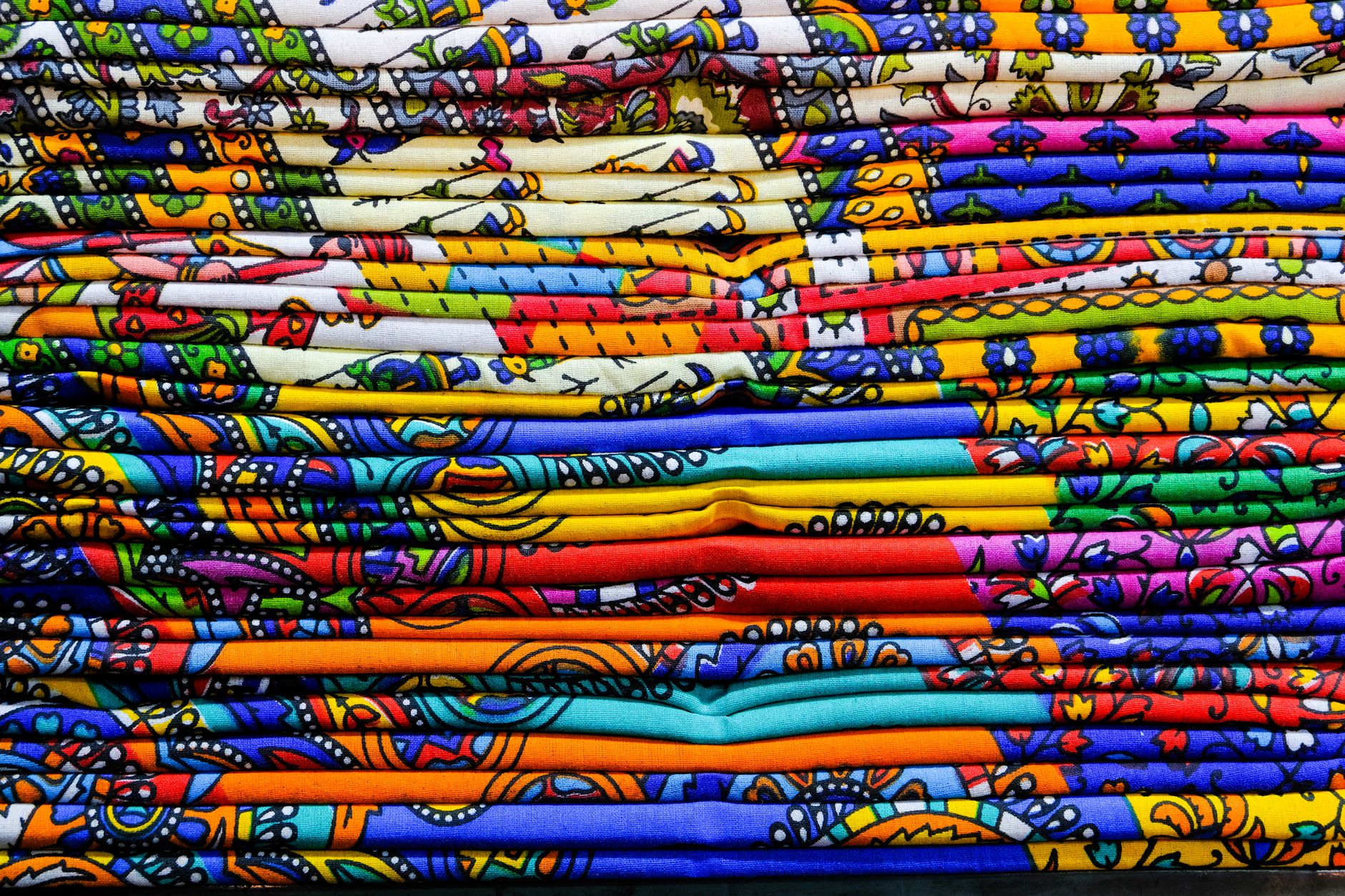
Marni’s recent collections have leaned hard into something the quiet luxury crowd would find deeply uncomfortable: prints that don’t agree with each other. Florals layered over stripes. Geometric blocks placed next to organic watercolor-style motifs. Checks colliding with abstract painterly marks. The brand isn’t doing this carelessly – the color stories are controlled, the silhouettes often remain clean and structural – but the surface chaos is intentional and unapologetic.
What makes the Marni approach work where lesser attempts at print-mixing tend to fall apart is discipline in the underlying architecture. The brand’s design team consistently anchors clashing prints within a shared color temperature. Two prints might look wildly different in pattern and scale, yet share the same dusty terracotta undertone or the same muddy sage green, which keeps the eye from spinning out. The conflict is real, but it’s managed conflict – there’s a logic underneath the disorder.
This is a meaningful departure from the approach that dominated high fashion from around 2022 onward. The quiet luxury aesthetic’s philosophy – reduce, refine, understate – pushed fashion toward a kind of competitive blankness. The best outfit was the one that communicated wealth and taste without saying anything specific. Marni’s current direction says quite a lot. It says something about mood, about visual pleasure, about a willingness to look slightly chaotic and enjoy it.
The brand has always occupied a particular lane in the luxury market – cerebral but warm, arty but wearable, expensive-feeling without the corporate rigidity of some heritage houses. The current print direction isn’t a departure from that identity so much as an amplification of it. Marni has always been the fashion person’s fashion brand, and leaning into print clashing right now is almost a thesis statement: you can be sophisticated and loud at the same time.

Why This Moment, Why Marni
Fashion cycles are shorter now than they were a decade ago, and the backlash to any dominant aesthetic tends to arrive before the trend has fully peaked. Quiet luxury is still very much present on the street and in retail – but the conversation around it has started to curdle slightly. There’s a growing sense that the aesthetic, which began as a reaction to logo-heavy maximalism, has become its own form of conformity. A sea of camel coats and ivory knits is still a uniform, even if it’s a refined one.
Marni’s timing is sharp. The brand is capturing an audience that has absorbed the lessons of quiet luxury – good fabric, good cut, restraint in silhouette – but wants to reintroduce personality at the surface level. These aren’t customers abandoning quality for noise. They’re customers who want both: the structural credibility of a well-made garment and the visual interest of a print story that rewards looking closely.
There’s also a generational dimension to this. Younger luxury consumers have grown up with visual overload as the baseline condition. For them, the quietness of the quiet luxury aesthetic can read as either aspirational restraint or, depending on the mood, slightly joyless. Marni’s print language offers something that feels both considered and alive. A clashing print outfit can look undone in a way that takes real confidence – the opposite of the anxious perfectionism that quiet luxury sometimes projects.
The styling that’s emerged around the brand’s print pieces is worth noting separately. Marni’s runway looks tend to stack prints with structured bags, with flat shoes or chunky sandals, and with minimal jewelry. The chaos is concentrated in the fabric, not dispersed across the whole look. That containment is what separates the approach from the print-heavy styling that feels costumey or overwrought – the surrounding elements are simple enough that the prints become the entire point rather than one element competing with several others.
Retail response has tracked the critical attention. The brand’s printed pieces move quickly at the boutique level, and the secondary market for key Marni print items has stayed strong. When resale value holds up on pieces from a collection that’s specifically about surface-level boldness, it signals that the approach is landing as a genuine aesthetic conviction rather than a seasonal gimmick.
What This Means for the Broader Conversation
Other brands are watching. Print-heavy moments from houses with less rigorous editorial instincts than Marni risk looking like noise rather than intention – the difference between a considered clash and a desperate one is often invisible to the outside eye but felt immediately when you encounter the real thing. Marni gets away with it partly because the brand has the visual language built up over years to justify the boldness. A brand trying to replicate the energy without that foundation tends to produce looks that feel frantic rather than free.
The more interesting question is whether Marni’s print moment actually displaces quiet luxury or simply runs parallel to it – whether fashion is making room for two different kinds of sophistication at once, or whether one aesthetic genuinely has to give ground for the other to expand. Luxury fashion has rarely been good at tolerating ambiguity in its trend narratives, and editors will eventually be forced to declare a winner. The fact that Marni is already filling showrooms and cover stories while quiet luxury still holds strong at retail suggests that the answer, at least for now, is deeply uncomfortable for anyone who prefers their fashion conversation tidy.


